| Sex | BW |
|---|---|
| F | 2.15 |
| M | 2.55 |
| F | 2.95 |
| F | 2.70 |
| M | 2.20 |
| F | 1.85 |
| M | 2.55 |
| M | 2.60 |
Using Chart Builder in SPSS
Cheatsheet
About
This cheat sheet provides a step-by-step guide to plotting various chart types, customising elements, and refining of the visualisations in SPSS.
NoteAssumed knowledge
- You have SPSS installed, ideally version 28.0 or later.
- You can follow instructions to select, click and drag elements in SPSS.
ImportantData structure
The data should be in a long format (also known as tidy data), where each row is an observation and each column is a variable (Figure 1). If your data is not already structured this way, reshape it manually in a spreadsheet program or in R using the pivot_longer() function from the tidyr package.
| F | M |
|---|---|
| 2.15 | 2.55 |
| 2.95 | 2.20 |
| 2.70 | 2.55 |
| 1.85 | 2.60 |
Data
TipDownload data
We have two separate datasets. The first dataset is part of the possums dataset used in BIOL2022 labs. It contains two numerical variables: ExpBLUP and AactiveTBLUP. The data is available in the file possums-blup.csv.
The second dataset, penguins.csv, contains data collected by Dr. Kristen Gorman and the Palmer Station, Antarctica LTER. Details about the dataset can be found here.
Creating a plot/chart in SPSS
| # | Step | Description | View |
|---|---|---|---|
| 1 | Import data | Open SPSS and load your data by going to File > Open > Data or by dragging and dropping a file into the SPSS window. | 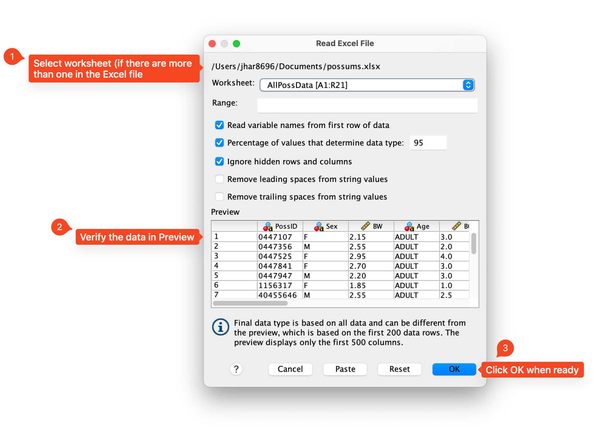 |
| 2 | Access Chart Builder | Click on Graphs > Chart Builder in the top navigation menu. | 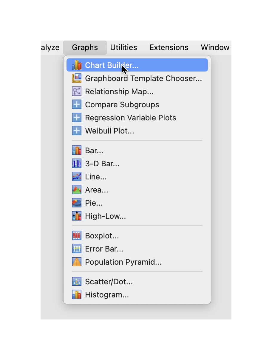 |
| 3 | Select a chart | In the Chart Builder dialog box, select the desired chart type from the Gallery tab, and drag it into the preview area. | 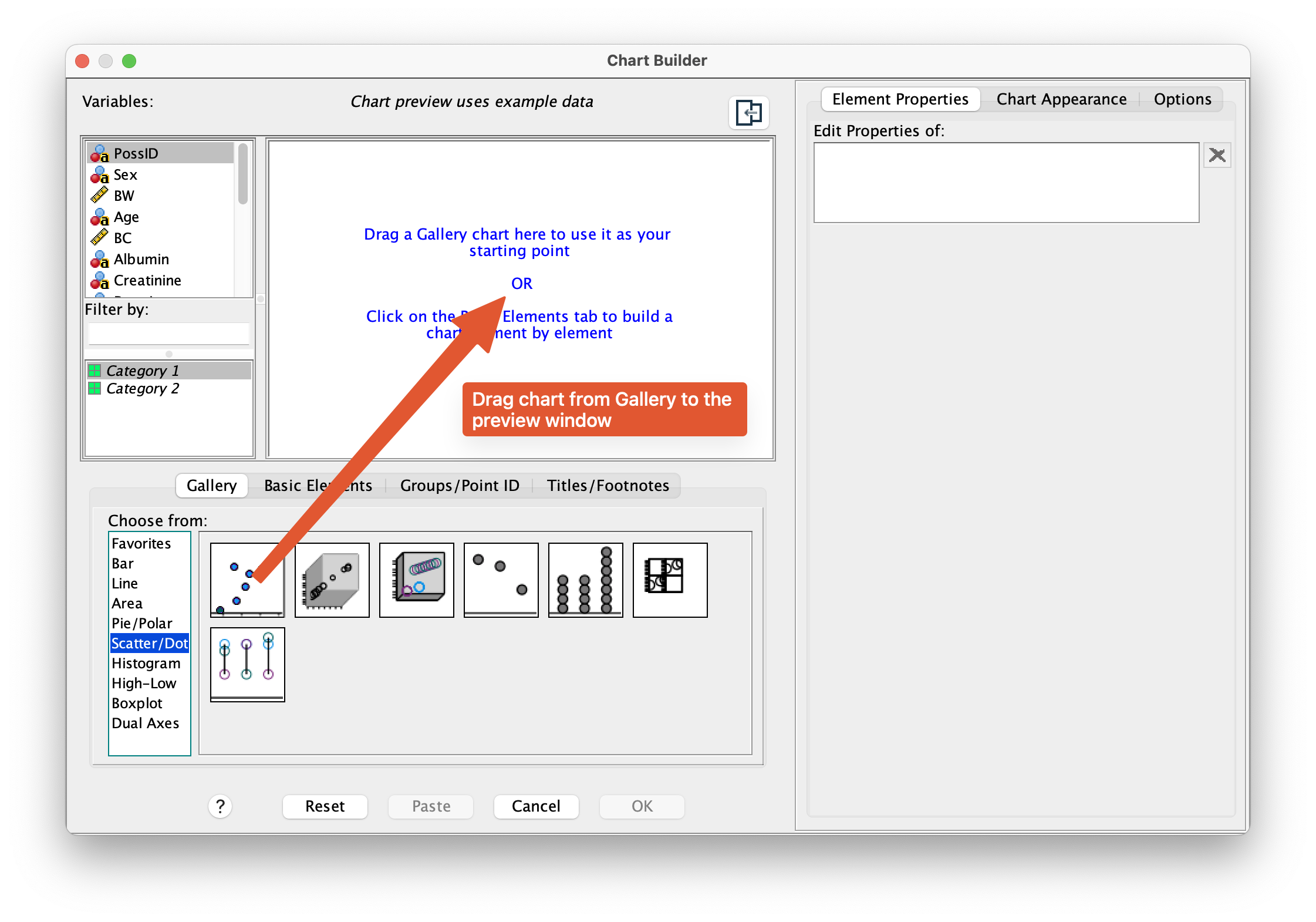 |
| 4 | Choose variables | Drag and drop the variables you want to plot into the appropriate fields (e.g., X-Axis, Y-Axis). | 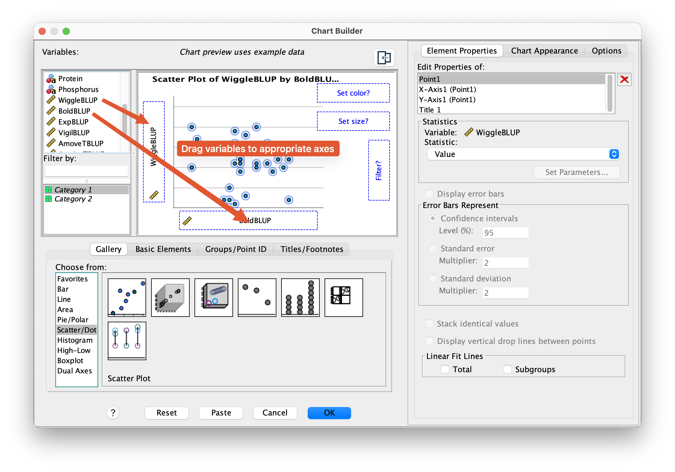 |
| 5 | Customize chart | Adjust chart elements such as titles, labels, colors, and patterns using the options in the Chart Builder dialog box. | 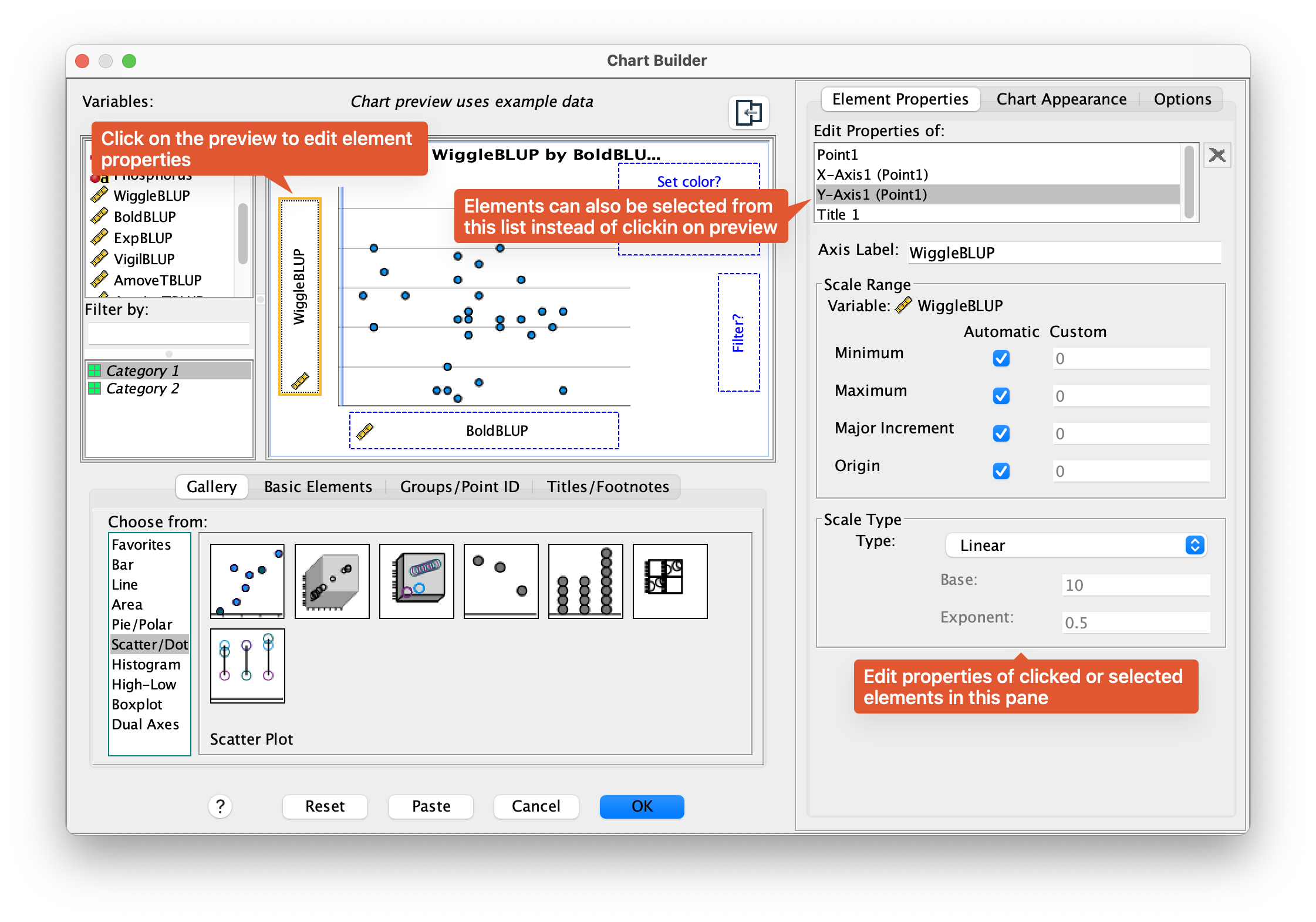 |
| 6 | Refine chart | Fine-tune the chart by adjusting axis scales, data point symbols, and other properties in the right panel. | 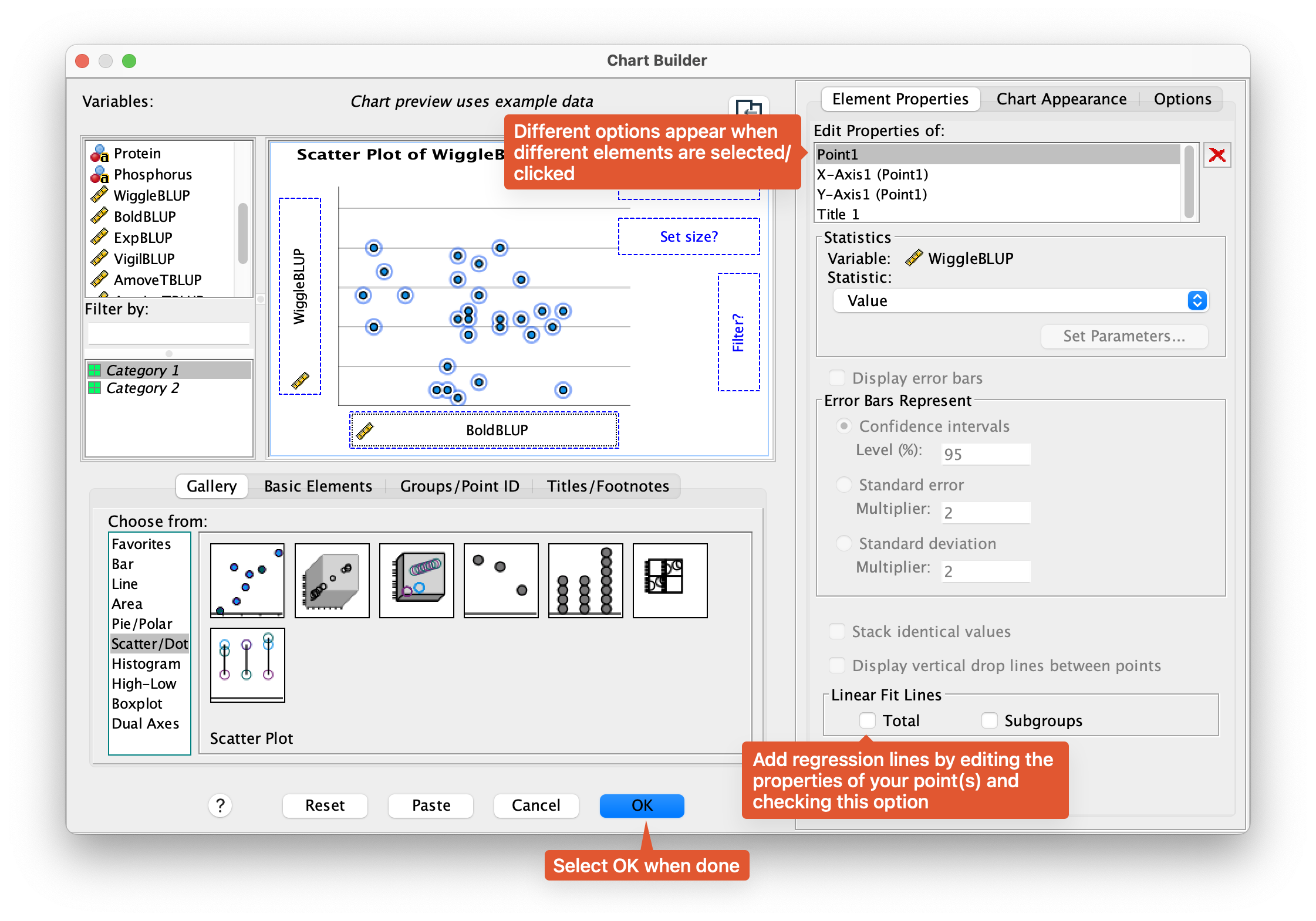 |
| 7 | Create chart | Click OK to generate your chart. You can edit the chart again by double clicking on it. To export, right click on the chart and select Export… |  |
Tips and Variations
- Use the Dual Y-Axis option for multiple scales.
- Experiment with different chart types and customizations.
- Save your chart as an image or copy it into another document.
Examples
Under construction!
Resources
- Building Charts by IBM SPSS – Official documentation on creating charts in SPSS.
- Charts from Curtin University’s Introduction to SPSS – sample data and instructions for creating various charts in SPSS.
License
This work was developed using resources that are available under a Creative Commons Attribution 4.0 International License, made available on the SOLES Open Educational Resources repository by the School of Life and Environmental Sciences, The University of Sydney.