Flexplot in Jamovi
A video cheatsheet
About
This cheatsheet provides a quick reference for using the flexplot module in Jamovi to create plots by specifying a formula. Depending on the variable types and the specified formula, flexplot can automatically generate a variety of plot types, including scatter plots and box plots.
Assumed knowledge
- Jamovi is installed and ready to use. This cheatsheet uses Jamovi 2.7.4.0.
- A basic understanding of statistical concepts and terminology, such as the difference between categorical and continuous variables.
- A basic knowledge of how to create model formulae, e.g., \(y \sim x\).
Data
We will use the well-known penguins dataset from the palmerpenguins R package. The dataset has been exported from the package in a format that Jamovi can read (.csv).
Install the flexplot module
If you have not already installed the flexplot module, you can do so by following these steps:
- Open the Modules tab in Jamovi.
- Click on Jamovi Library.
- Search for
flexplotand click Install.
Import data
- Click the hamburger menu at the top-left of the Jamovi window.
- Select Open to open the file dialogue.
- In the dialogue, navigate to the folder where you saved
penguins.csvand click Open.
Plot
Recalling formulae syntax
In most cases, general linear models can be described using a standardised formula syntax. For a response variable that is influenced by a predictor variable, the formula would be:
\[Y \sim X\]
which corresponds to the statement
The response \(Y\) is predicted by \(X\)
\[response \sim predictor\]
Plotting
- In the Analysis tab, click on the Flexplot option.
- Select the response variable and drag it to the ‘Outcome variable’ box.
- Select the predictor variable and drag it to the ‘Predictor variable’ box.
- Tinker with the plot options to customise the behaviour of the plot.
Examples
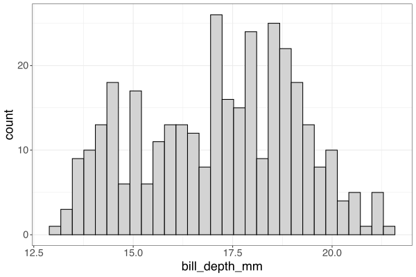
Single continuous \(Y\)
This produces a histogram or a boxplot.
Continuous \(Y\), continuous \(X\)
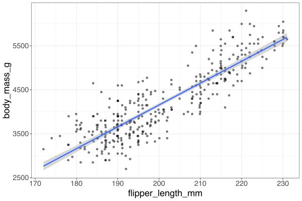
This produces a scatterplot. You should explore the options for a fitted line, confidence bands, and jittering.
Continuous \(Y\), categorical \(X\)
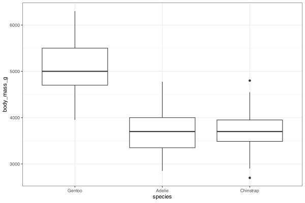
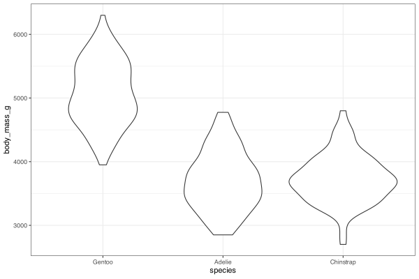
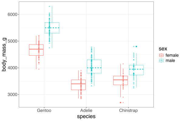
This produces various plots, such as the boxplot and the violin plot. The categorical variable \(X\) is used to group the data.
Continuous \(Y\), multiple \(X\)
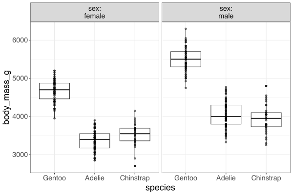
If you add multiple \(X\) variables, you can explore more ways to visualise the relationships between them. Use panelling to create separate plots for each combination of \(X\) variables.
Note: The video explores some of the options available for mixed plots and has no specific focus on a single plot type.
Attribution
This cheatsheet was developed using resources that are available under a Creative Commons Attribution 4.0 International license and made available on the SOLES Open Educational Resources repository.