| Sex | BW |
|---|---|
| F | 2.15 |
| M | 2.55 |
| F | 2.95 |
| F | 2.70 |
| M | 2.20 |
| F | 1.85 |
| M | 2.55 |
| M | 2.60 |
Boxplots in Jamovi
Cheatsheet
This work was developed using resources that are available under a Creative Commons Attribution 4.0 International License, made available on the SOLES Open Educational Resources repository by the School of Life and Environmental Sciences, The University of Sydney.
About
The boxplot is a visual representation of a dataset’s distribution, showing the median, quartiles, and outliers. It is useful for comparing distributions between groups and identifying outliers within a single group.
NoteAssumed knowledge
- You have Jamovi installed ideally 2.5.7.0 or later.
- You can follow instructions to select, click and drag elements in Jamovi.
ImportantData structure
The data should be in a long format (also known as tidy data), where each row is an observation and each column is a variable (Figure 1). If your data is not already structured this way, reshape it manually in a spreadsheet program or in R using the pivot_longer() function from the tidyr package.
| F | M |
|---|---|
| 2.15 | 2.55 |
| 2.95 | 2.20 |
| 2.70 | 2.55 |
| 1.85 | 2.60 |
Data
For this cheatsheet we will use part of the possums dataset used in BIOL2022 labs.
Import data
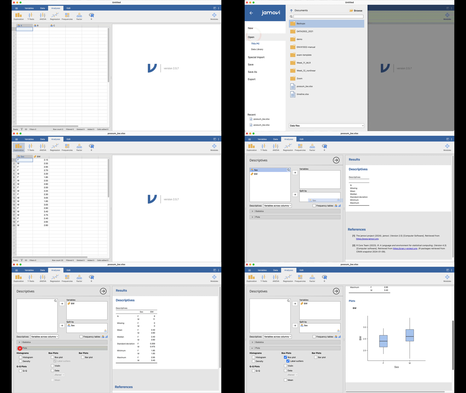
- Click on the Menu icon:

- Select Open > Browse, and navigate to the downloaded file.
- Click Open to load the data.
Plot
- Click on the Analyses tab.
- Select Exploration > Descriptives.
- Add
Sexto the “Split by” box. - Add
BWto the “Variables” box. - In the “Plots” tab, select Boxplot.
Export
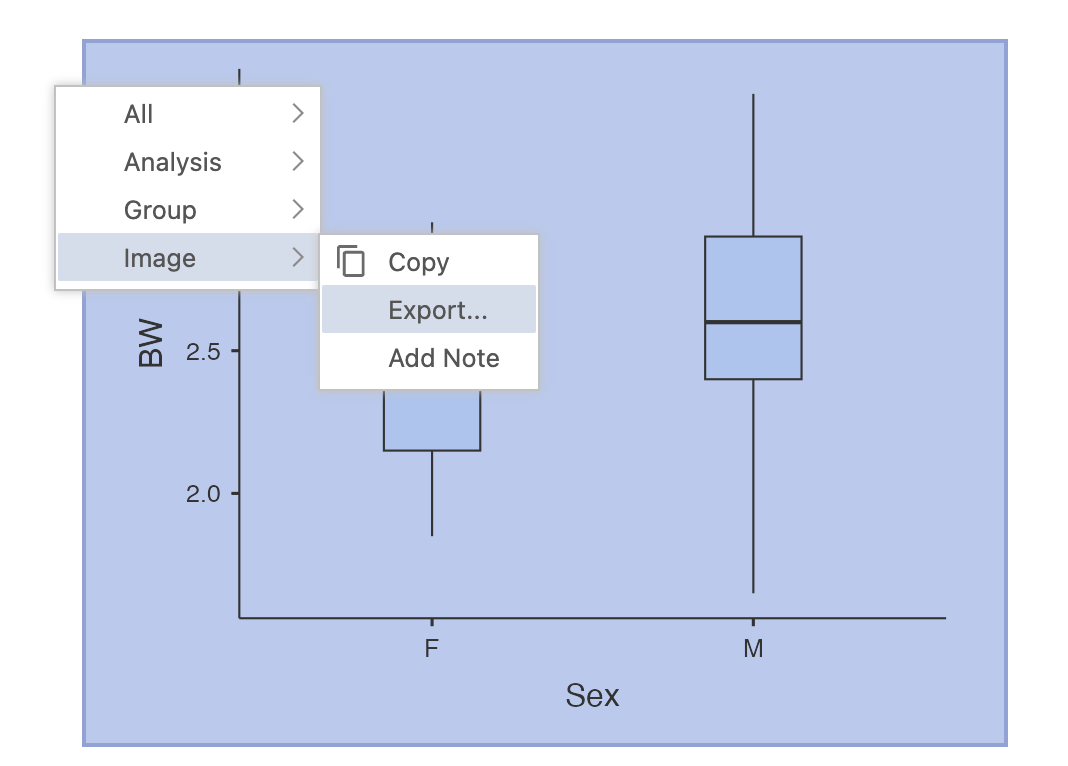
To export the plot, right click on the plot, select Image > Export… > Browse and rename the file before clicking on the Save button.